Brand Identity · Packaging · Social Media
A brand as warm and inviting as the bakery itself
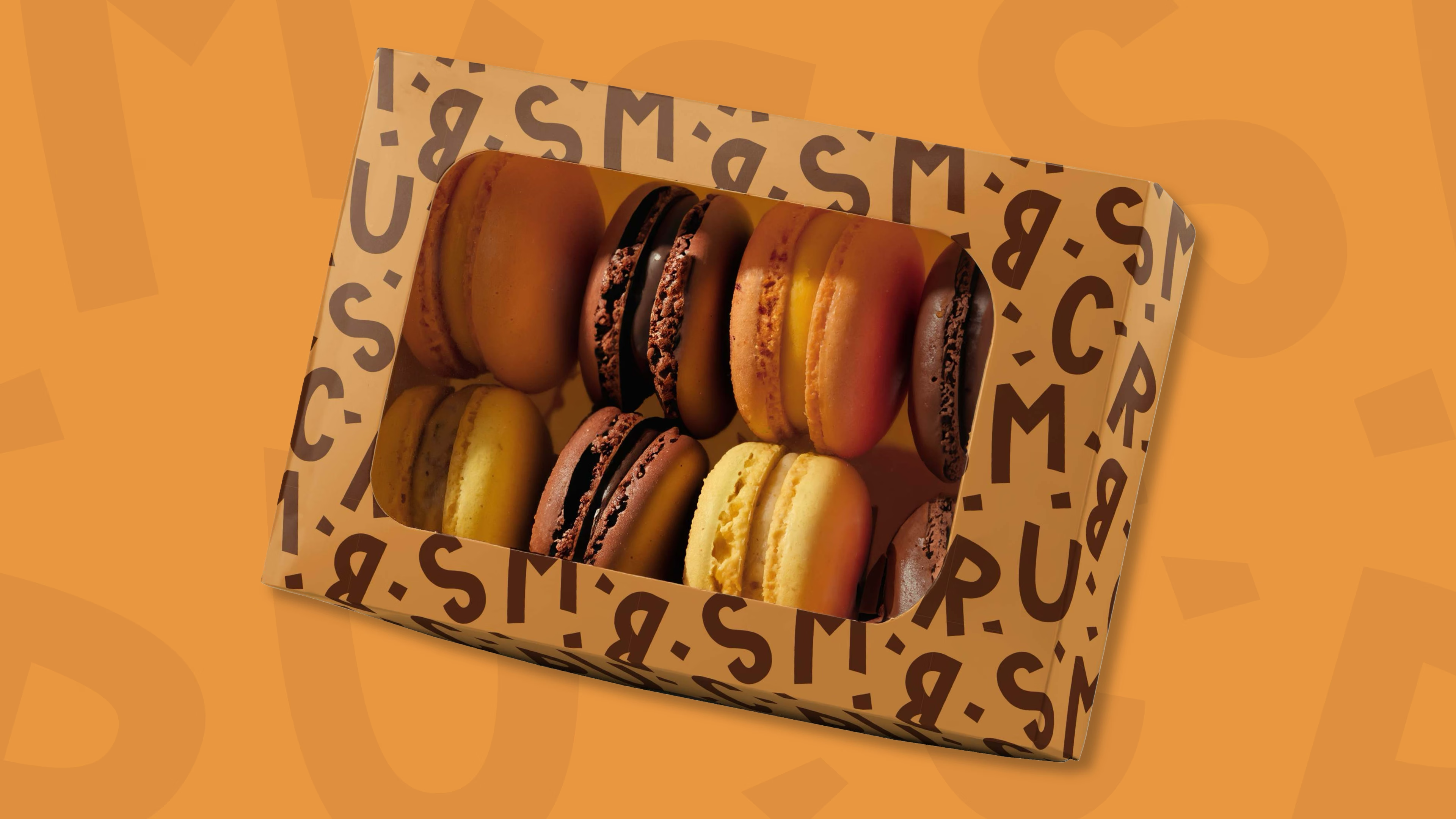
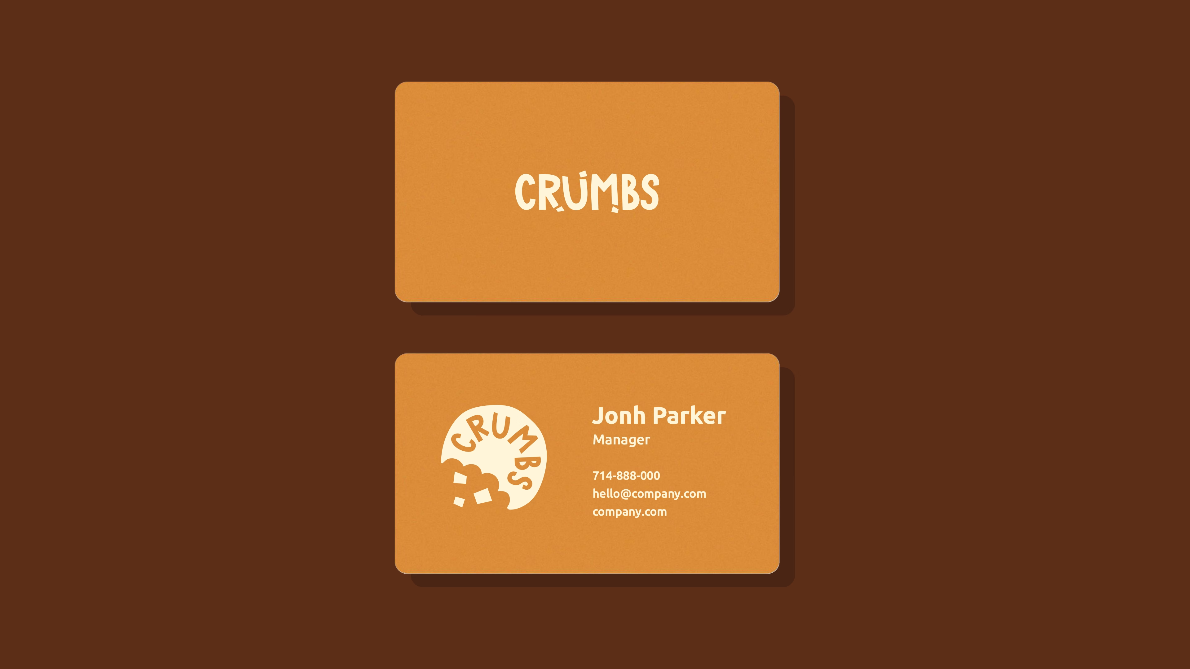
Crumbs is a bakery in Thailand built around handmade cookies, pastries, and desserts. We developed their complete brand identity — from logo and colour system to packaging, business cards, and social media templates — giving the brand a personality as distinct as its products.
The brief
A new bakery that needed a brand people remember
Crumbs was launching in a competitive market where food quality alone isn't enough to stand out. The founders wanted a visual identity that felt warm, playful, and approachable — something that would translate equally well to a box of macarons, an Instagram post, and a storefront sign.
The challenge was to create a brand with genuine character: one that didn't rely on generic food industry conventions but felt distinctly its own, while remaining versatile enough to work across every touchpoint.
Our approach
Character-first — then system
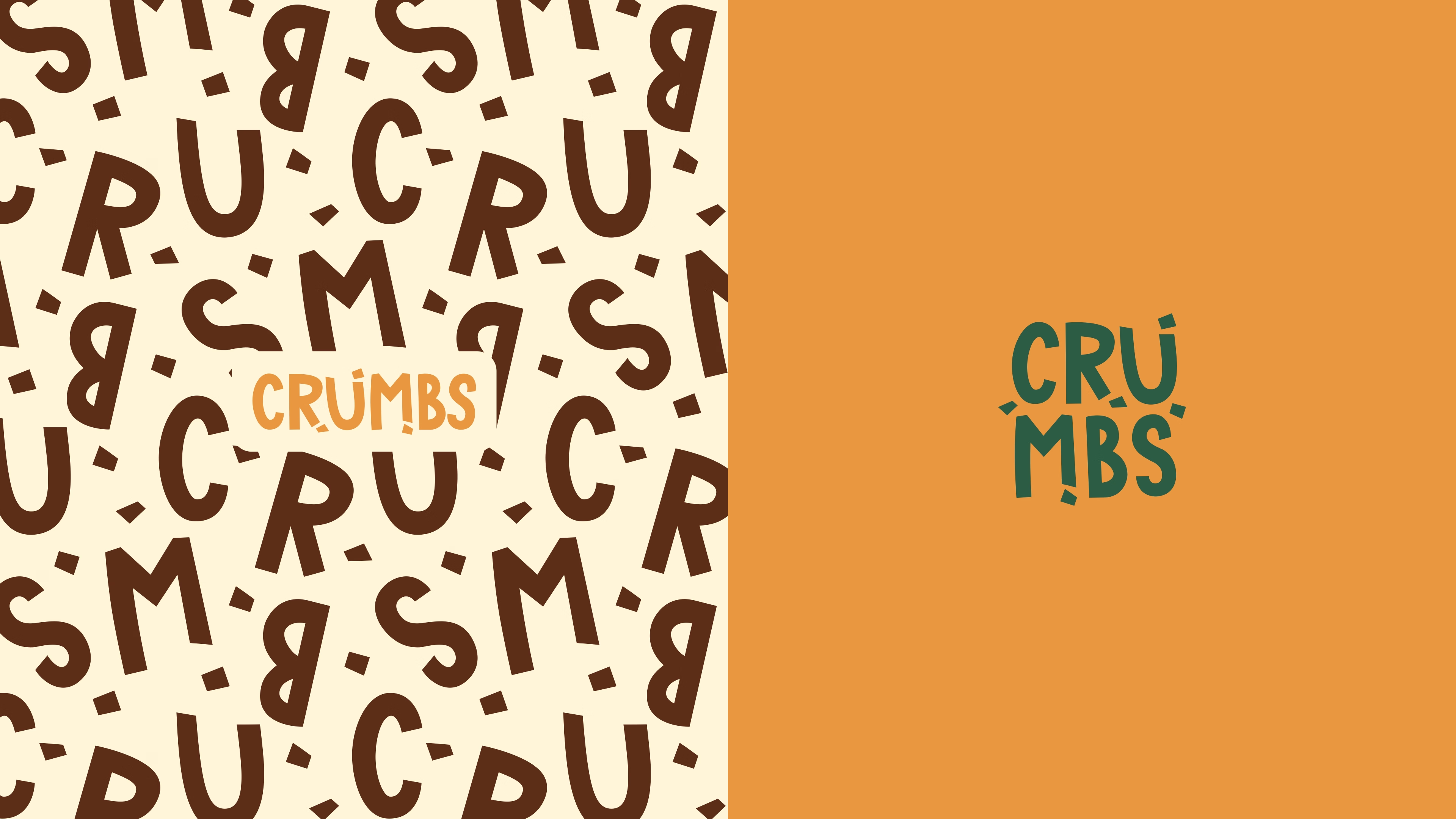
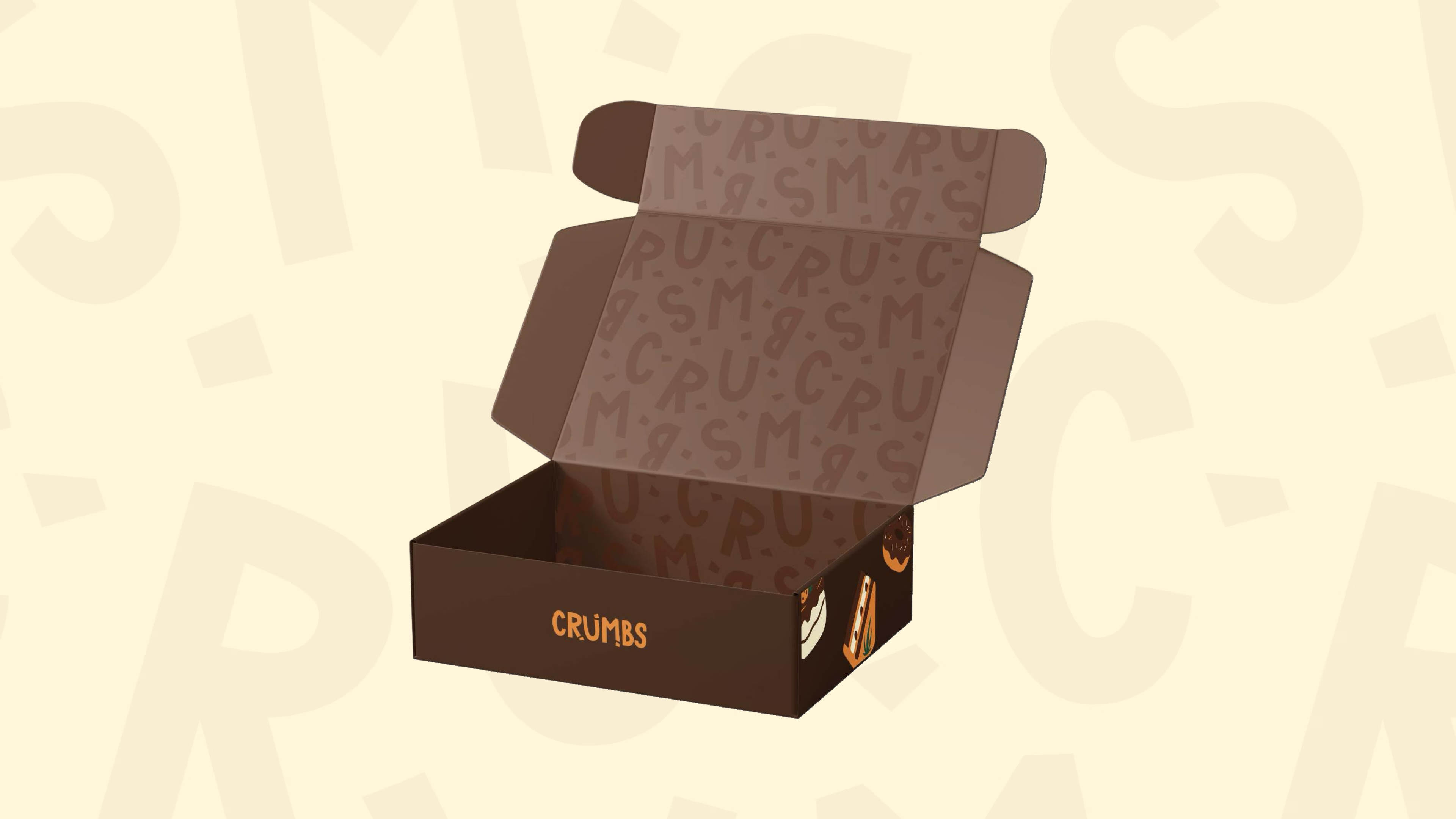
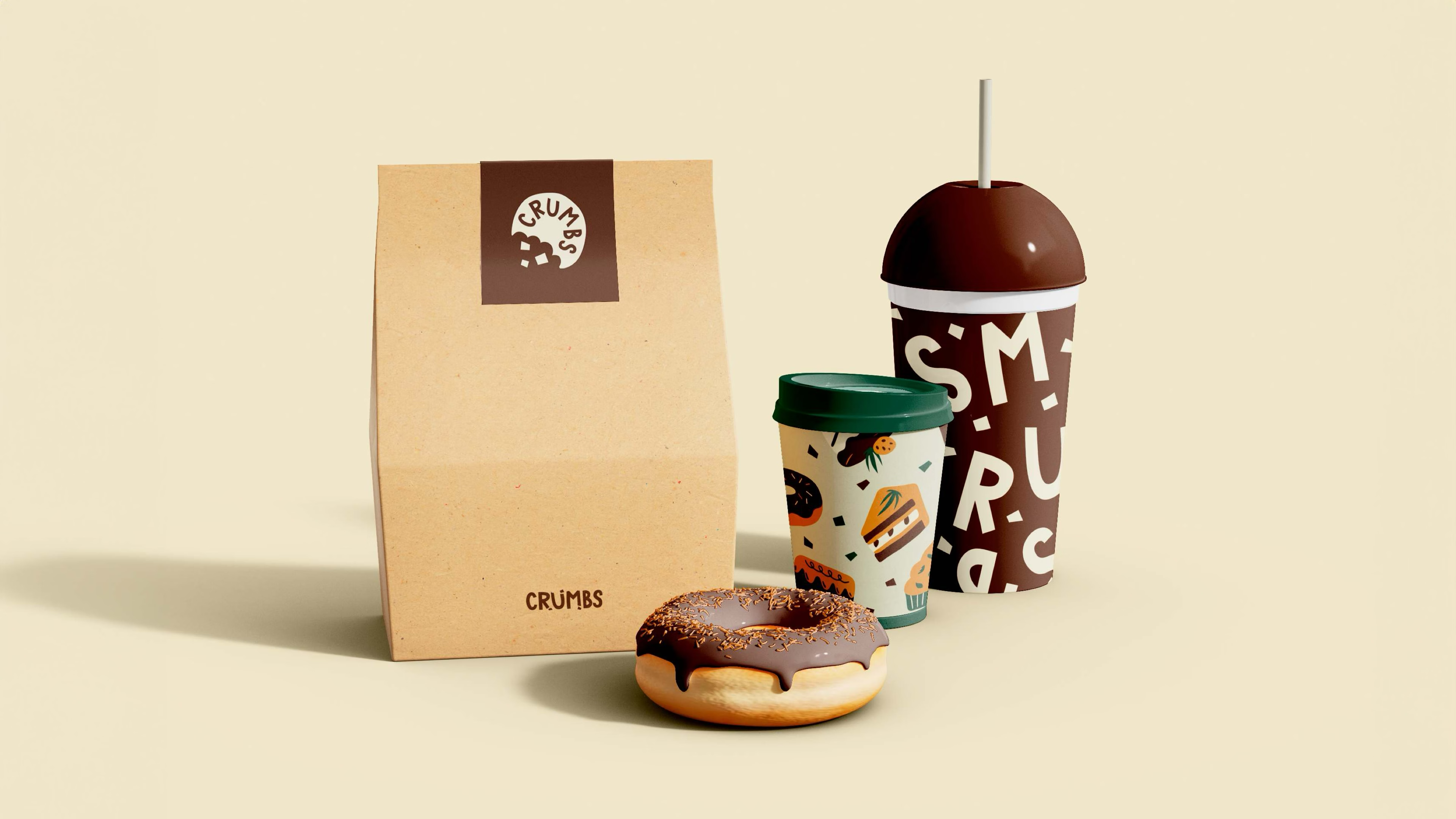
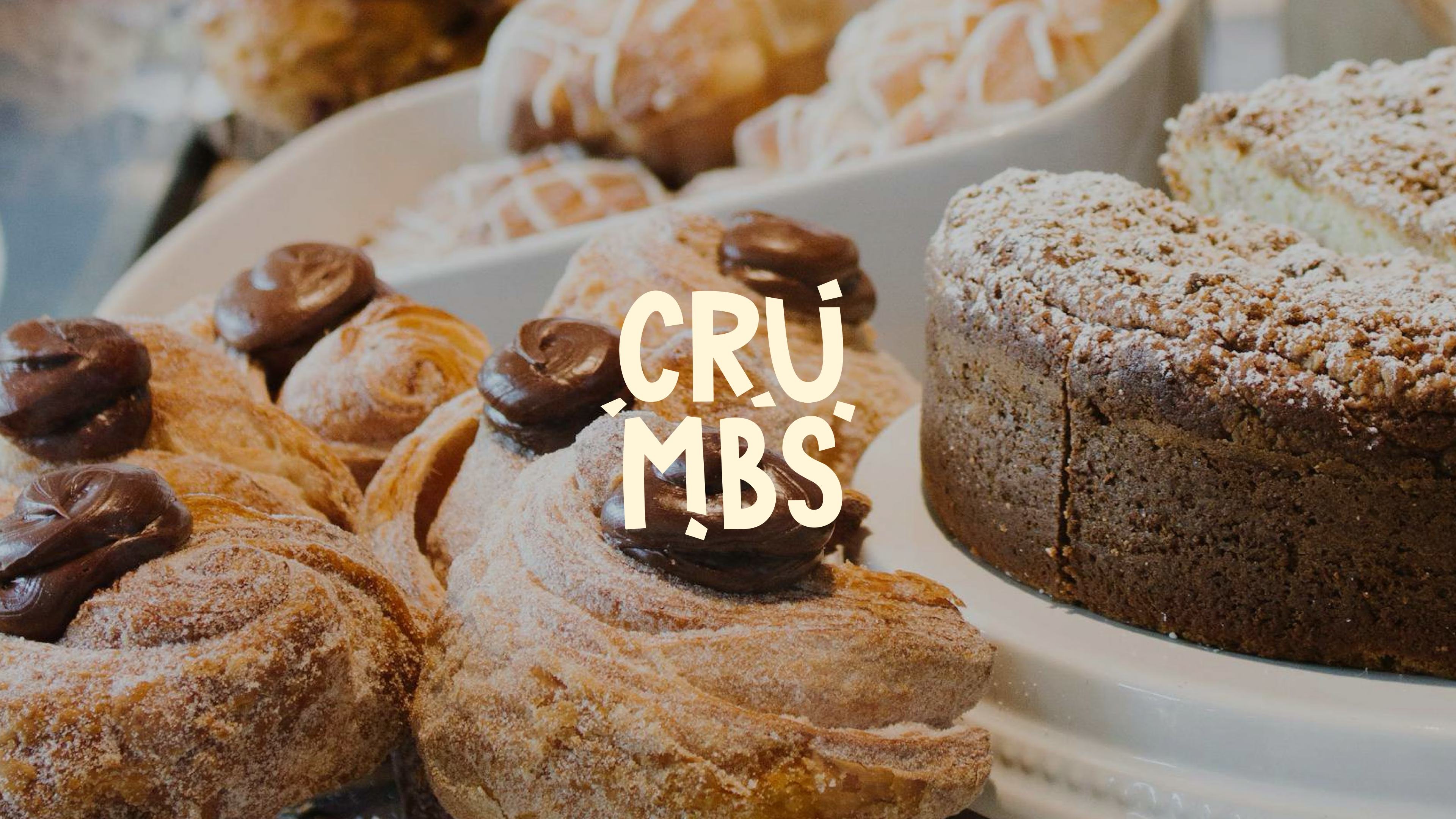
We started with the logo — a custom wordmark with hand-crafted letterforms that feel organic and slightly imperfect, like something baked rather than designed. The typography carries a warmth that distinguishes Crumbs from the polished, sterile visual language common in the premium bakery space.
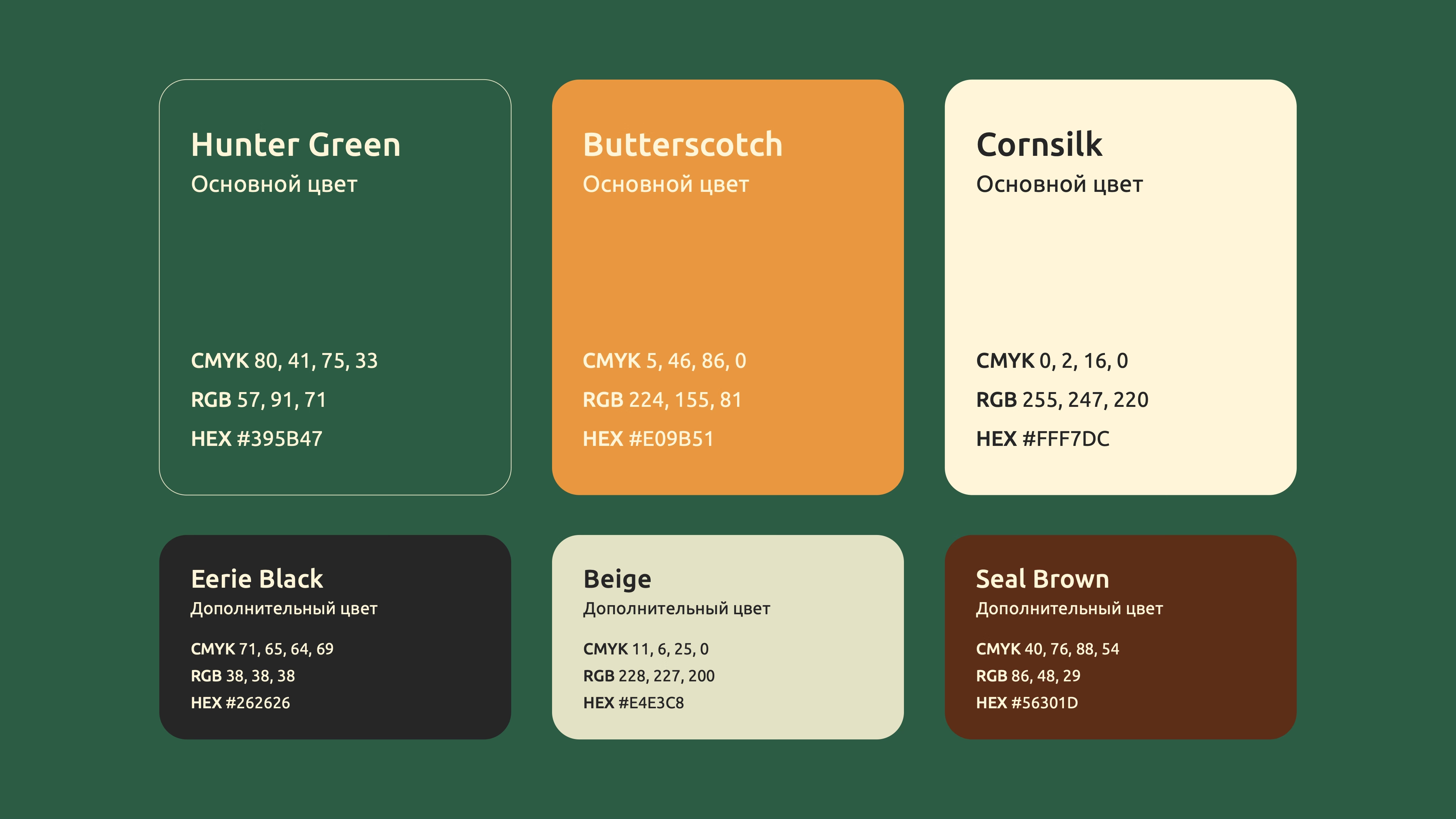
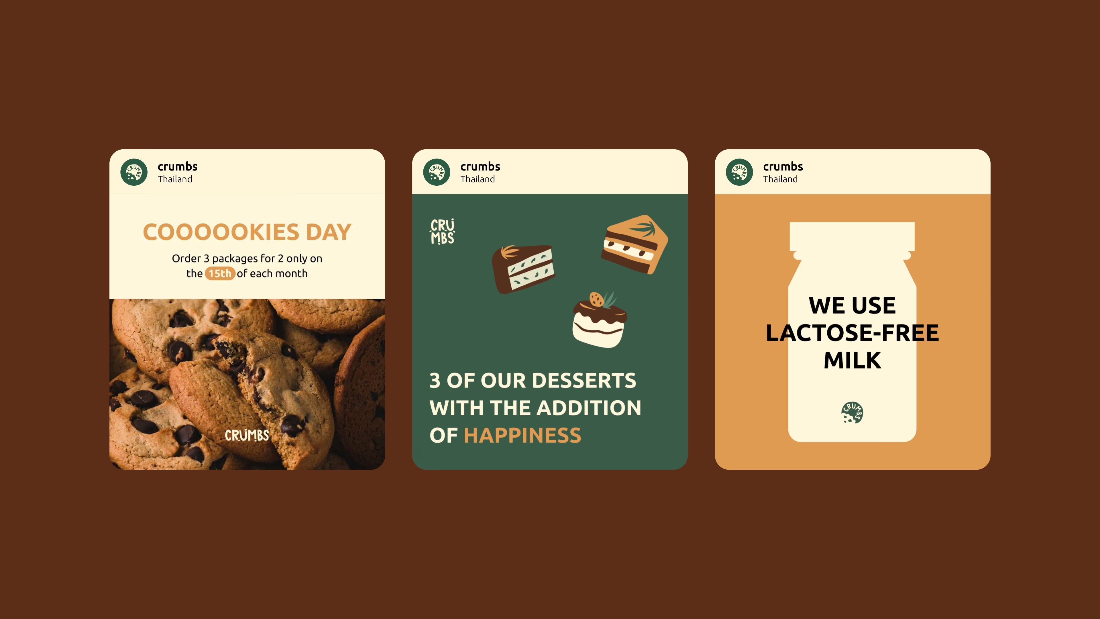
From the wordmark we built a complete system: a six-colour palette rooted in earth tones and warm amber, a brand pattern derived from the letterforms themselves, and a set of templates designed to make every piece of Crumbs communication instantly recognisable.
Logo system
Colour palette
What we delivered
The work
Building a brand from scratch?
We create full brand identities for food businesses, startups, and consumer brands across Europe and Asia. Let's talk about what yours needs.