Brand Identity · Stationery · Social Media
A brand built for trust in a market where trust is everything
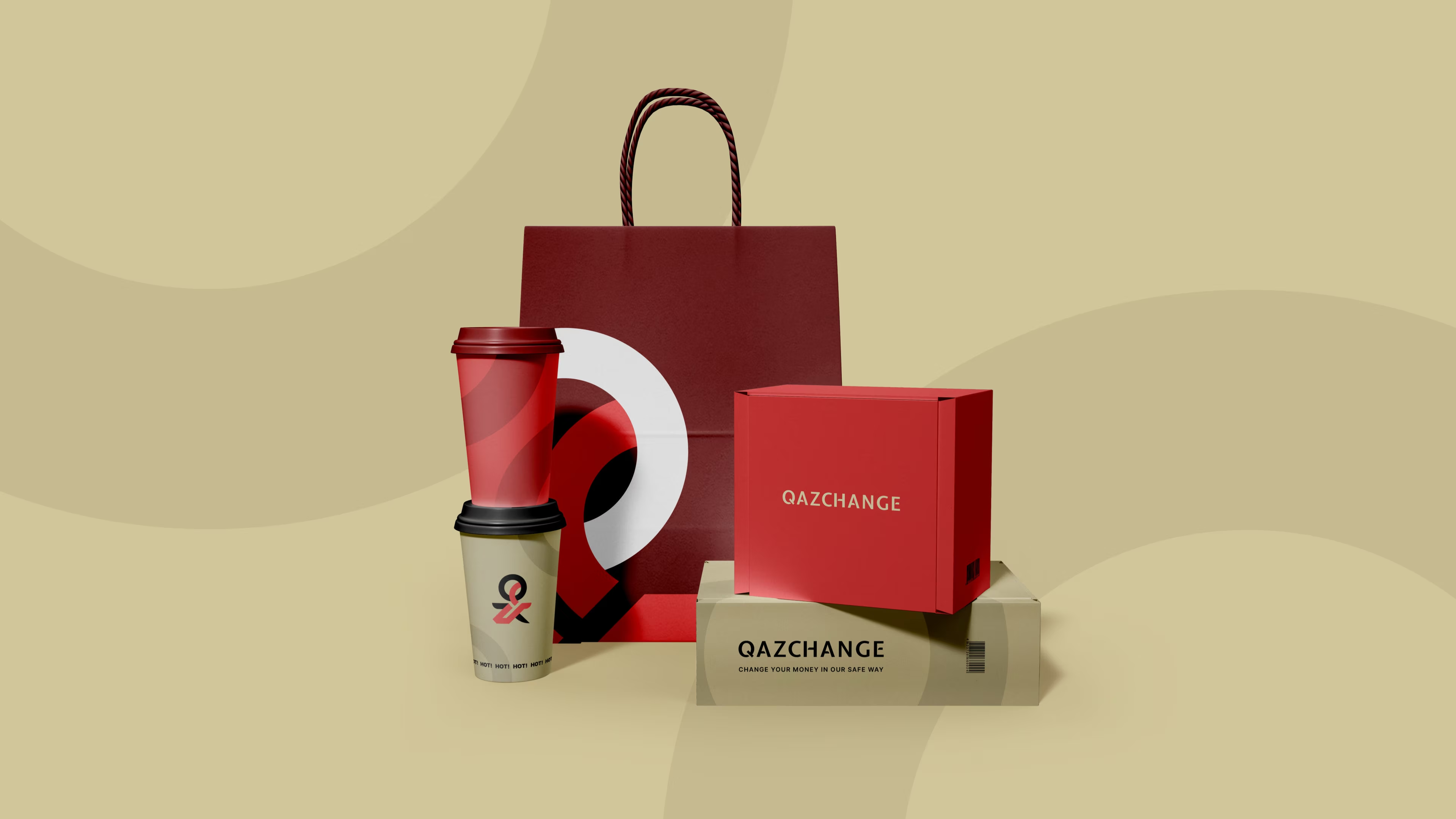
QazChange is a crypto and currency exchange based in Belgrade, Serbia. We developed their complete brand identity — from the custom logo mark and colour system to business stationery, social media templates, and out-of-home advertising — giving them a visual language as professional as the service they offer.
The brief
Credibility at first glance — in a sector that demands it
In financial services, a brand isn't decoration — it's a signal. QazChange needed a visual identity that would communicate professionalism, stability, and modernity to customers who are trusting them with real money.
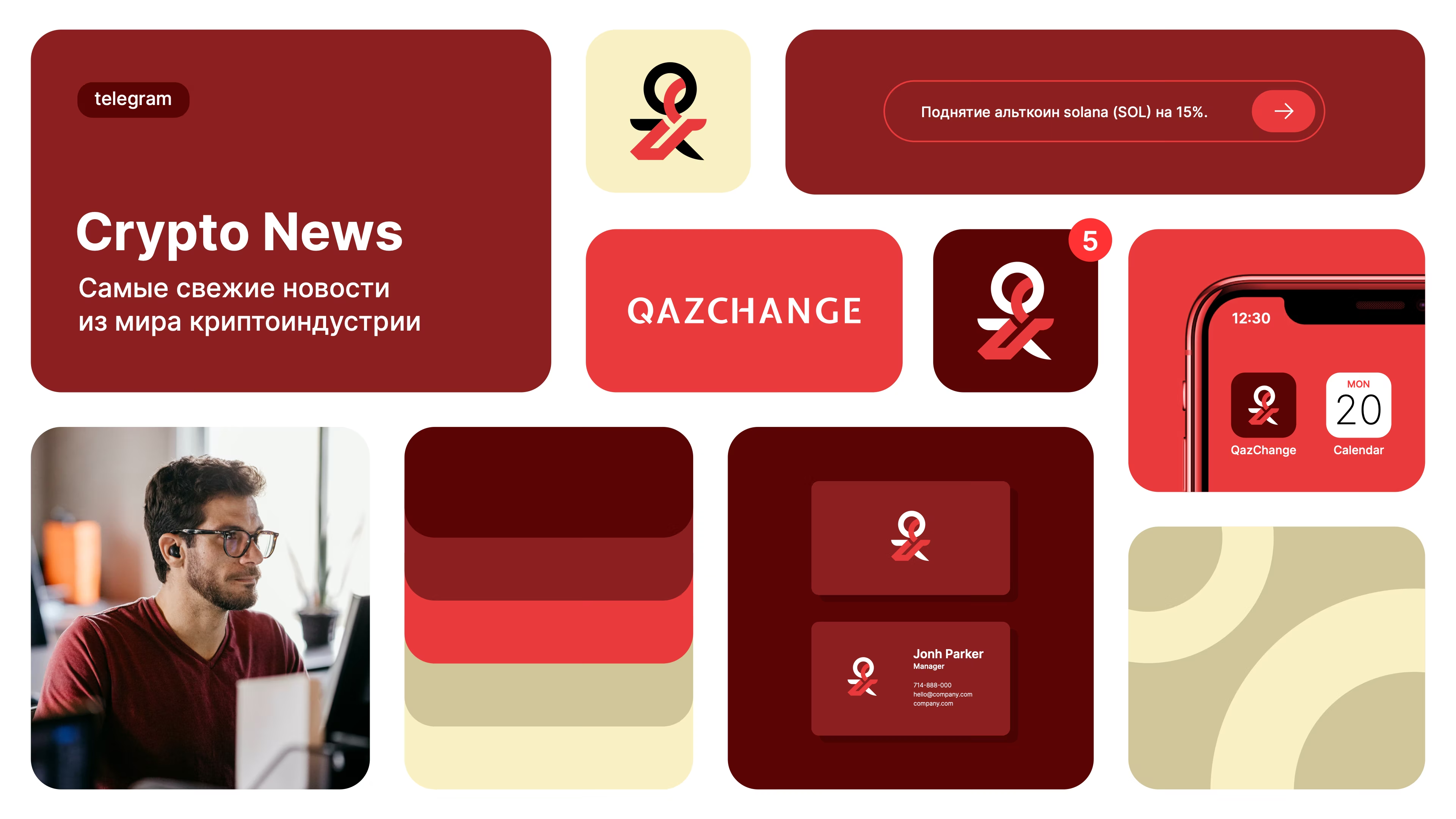
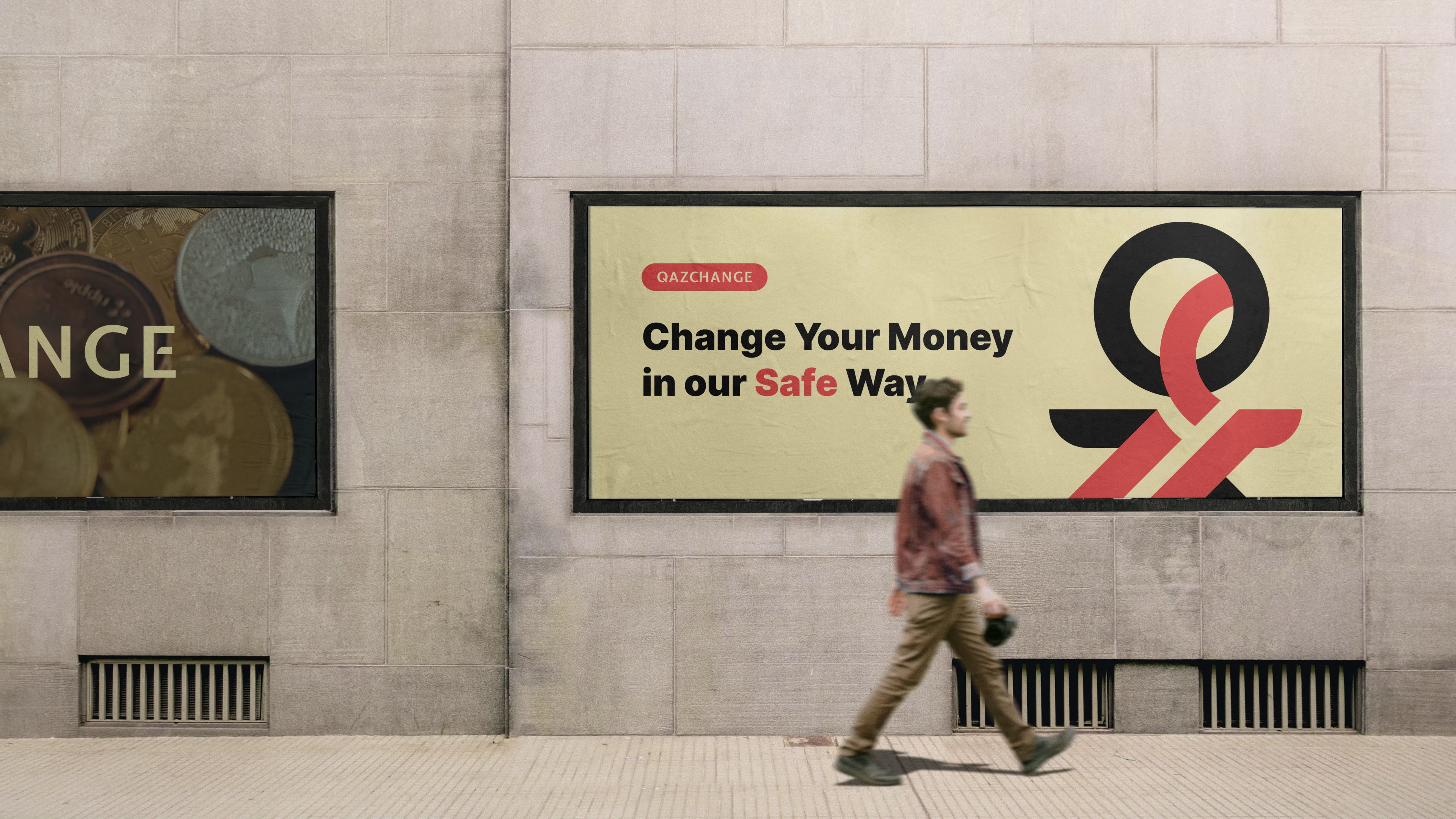
The brand had to work fluently in both Russian and English, scale from a mobile app icon to a building-sized billboard, and feel equally at home in a physical wallet and an Instagram story.
Our approach
A custom mark. A deliberate palette. No shortcuts.
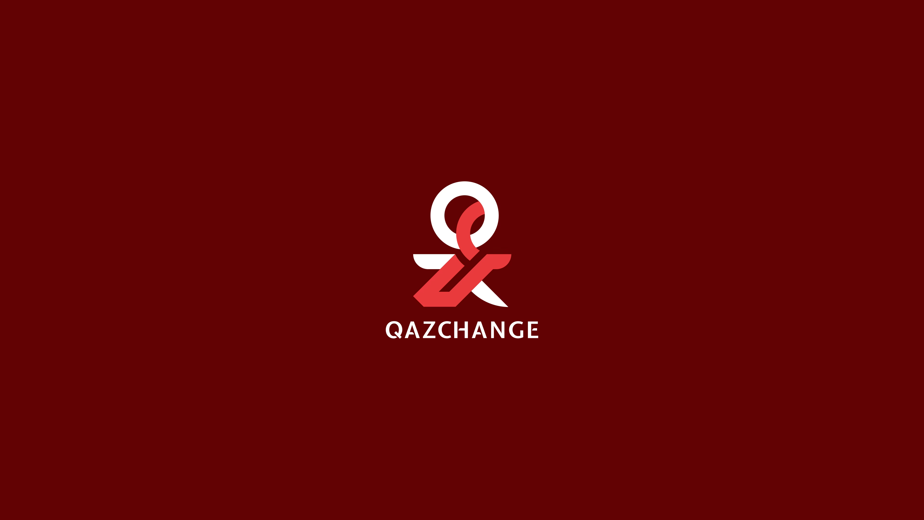
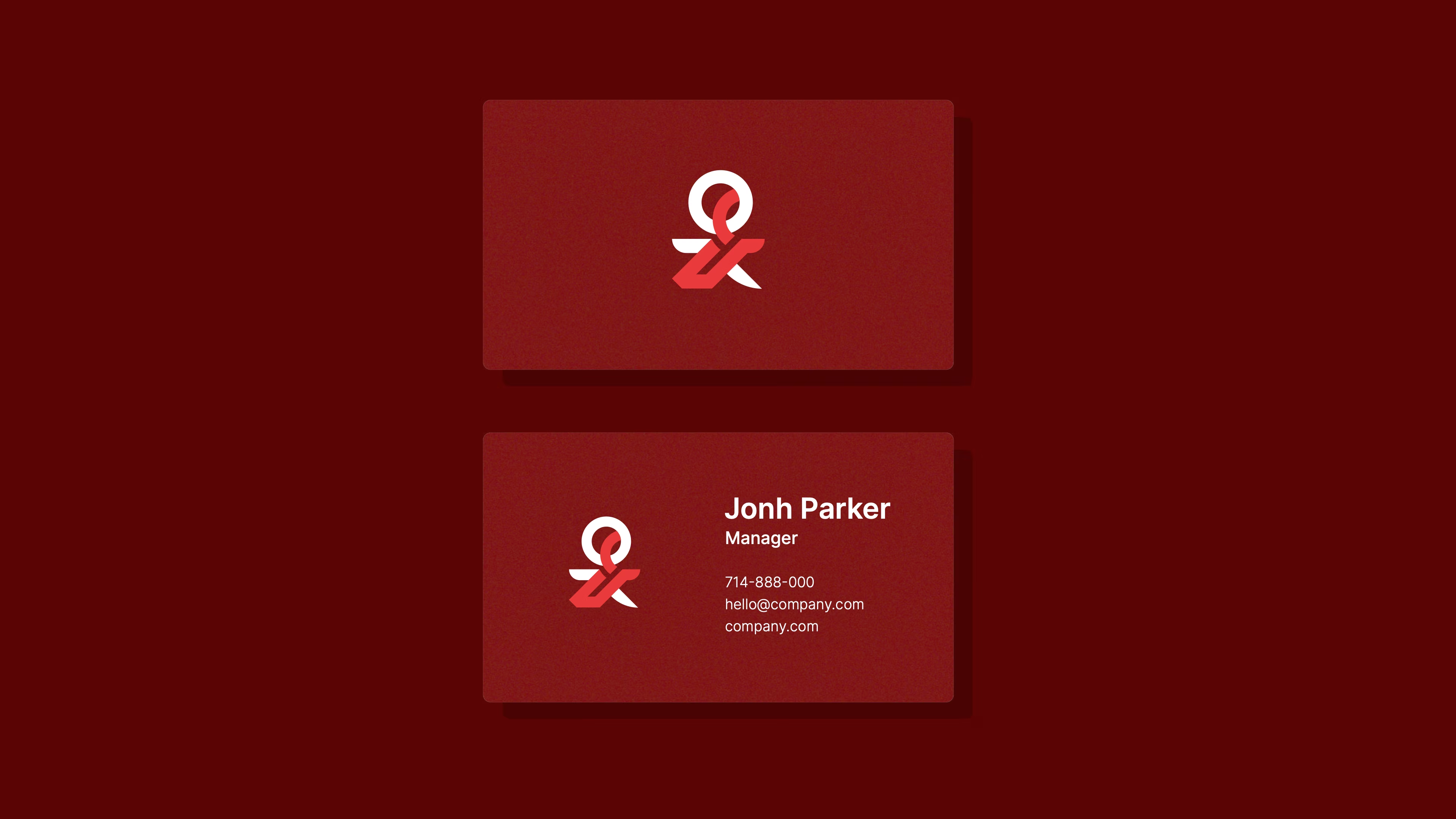
We designed the logo from scratch: a custom monogram that fuses the Q and X of the brand name into a single bold symbol — dynamic enough to suggest movement and exchange, structured enough to project reliability.
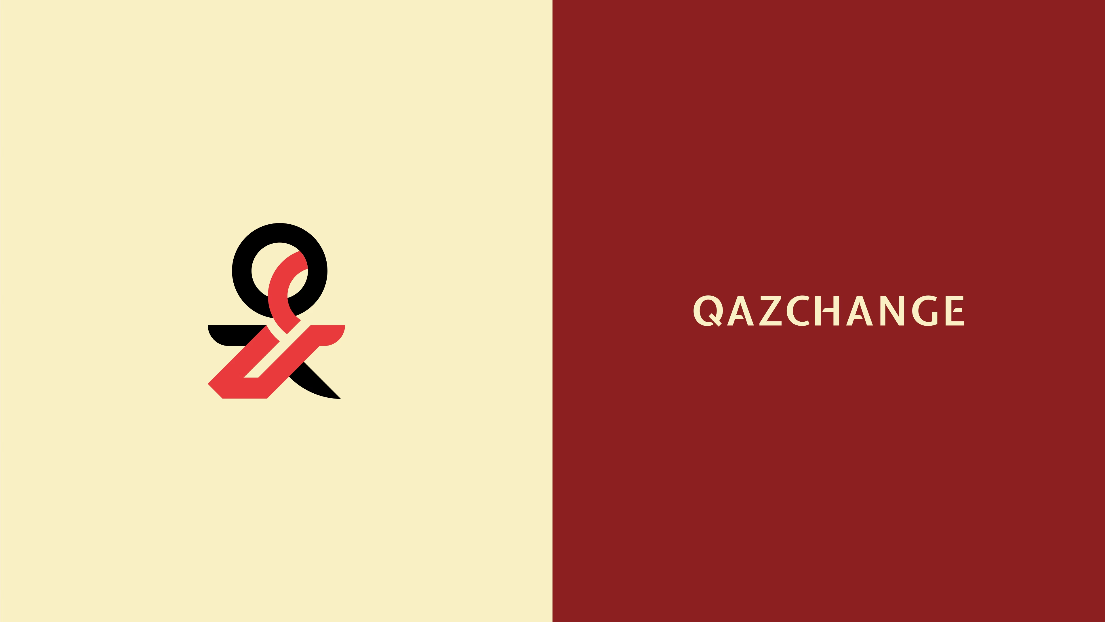
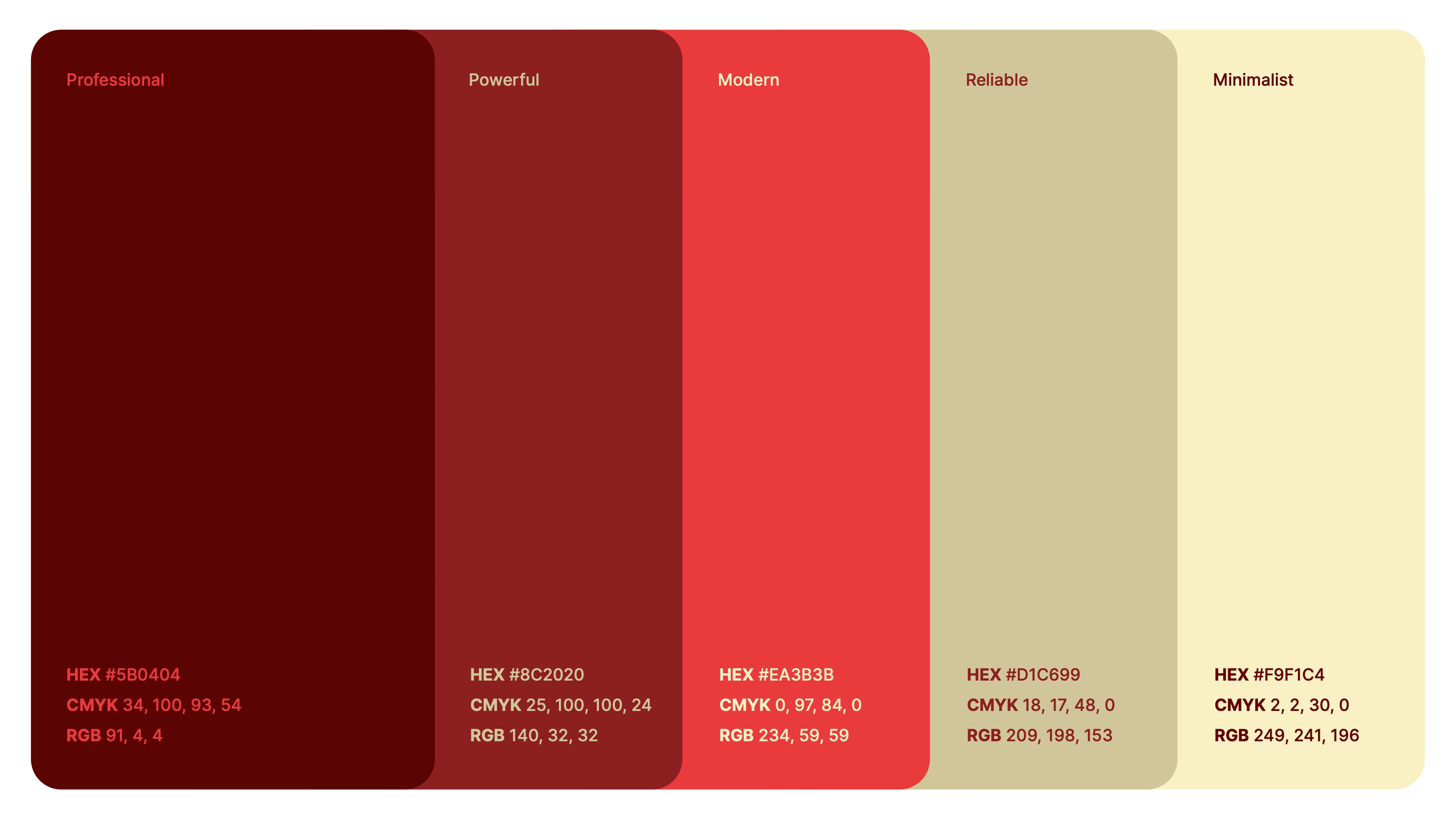
The crimson palette was chosen deliberately. Deep burgundy and vivid red read as confident and decisive, while the warm cream tones soften the brand for digital and print contexts where contrast needs to be managed. Inter was selected as the sole typeface for its technical clarity and full bilingual support.
Logo system
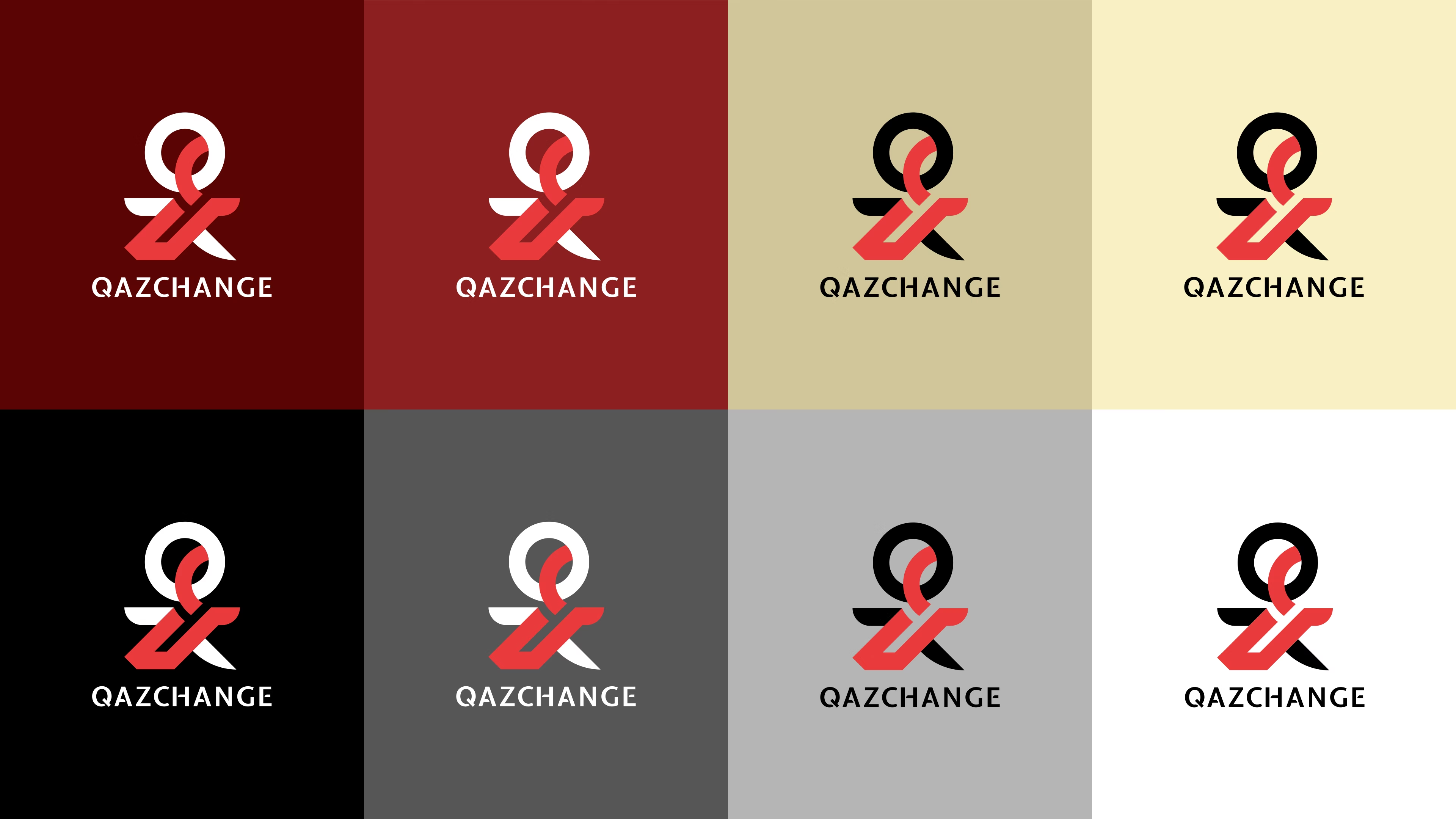
Colour palette
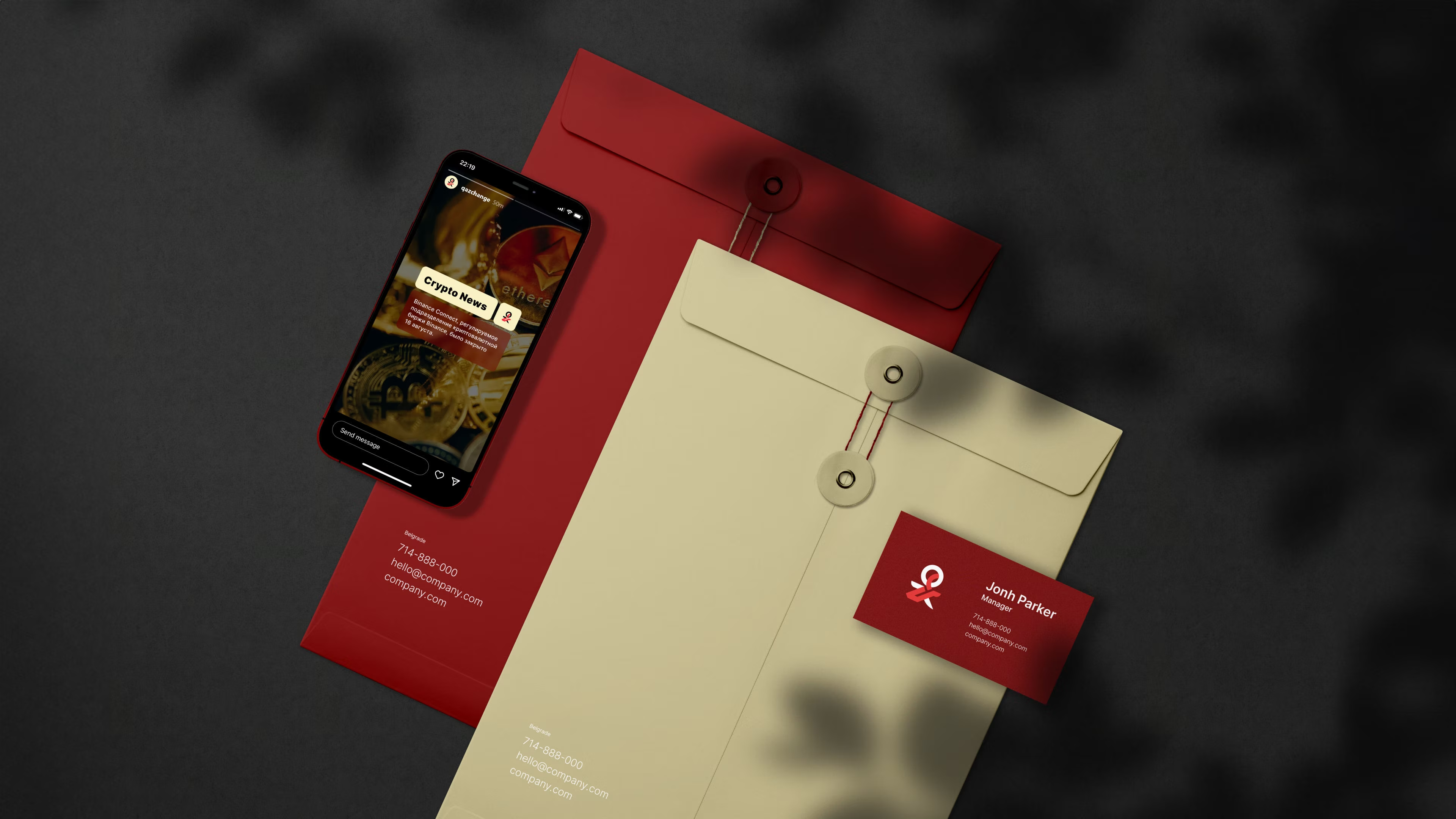
What we delivered
The work
Building a brand that commands trust?
We create full brand identities for fintech companies, startups, and growing businesses across Europe. Let's talk about what yours needs.